Research Posters 101


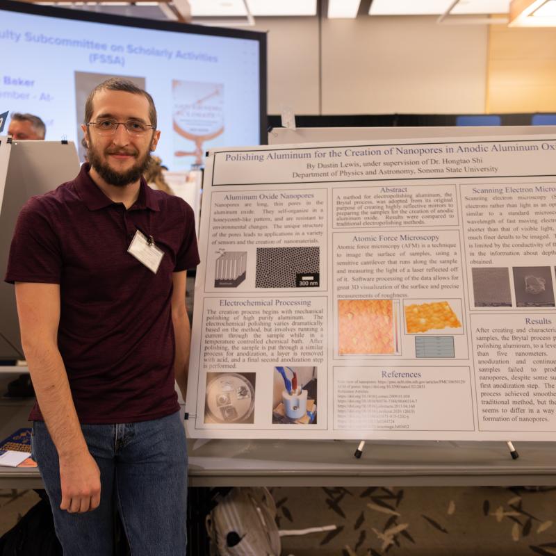
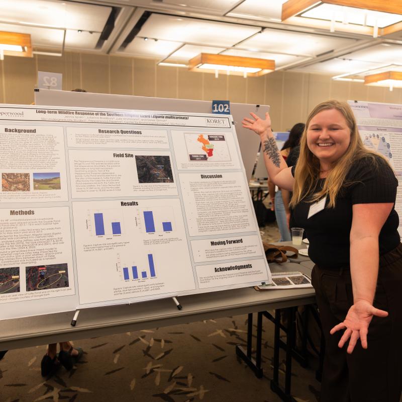
Do you need to create a poster for an academic conference, symposium, or senior capstone project? A well-crafted research poster is essentially a roadmap of your project, and this type of presentation, as opposed to an oral presentation, allows you to personally interact with people who are interested in your research topic.
There are a few things to consider before you get started:
For SSU’s Research, Scholarship & Creativity Symposium poster presentations, the standard size is 36” H by 48” W, but if you are presenting a poster outside of SSU, the first thing you should do is check with the conference organizers to determine their specific requirements.
Most research posters are created on a single Powerpoint slide, and you can also use Google Slides, which can be especially helpful if you’re working on a group project. Of course you can use some of the more advanced programs such as Adobe Illustrator; however, use of these programs often result in a file size that is too large to email, so if you need to email your final draft, it’s best to stick with PowerPoint or Google Slides.
The Powerpoint Poster Template below is already formatted to 36” H by 48” W and includes information on what should appear in the various sections of your poster.
Research Poster Template-PowerPoint
If you prefer Google, use the Google Slides Research Poster Template, which has already been formatted to 36" H by 48" W. When you open this file, click File>Make a Copy to create an editable version. Note: To set your poster size in Google Slides, click on File>Page Setup and select the down arrow to select “Custom” and enter the required dimensions.
Some of the most common headings for a research poster include:
- Background or Introduction
- Research Question and/or Hypothesis
- Methods and Materials
- Results
- Discussion
- Future Directions
- References
- Acknowledgments
Please keep in mind that there are many different heading options for the content of your poster. You should choose the headings that best fit your specific project.
- Font: Your poster should be readable from 5-7 feet away. On the poster template linked above, note that the title font is 96 pt., the headers are 70 pt. font, and the body text is 52 pt. One way to test your font size is to print a sample on standard copy paper. If you are having a difficult time reading the text in this format, your font is probably too small. Generally speaking, you should use the same text throughout.
- Text boxes: For balance, be sure to use text boxes that are uniform in height and width. Instead of passages of text, it’s best to use concise bullet points.
- Images: Images, graphs and tables are a great way to make you poster more visually appealing. Image resolution should be approximately 300 dpi in order to avoid a pixelated final product. If you don’t have images, graphs, and tables that are directly connected to your research project, you can use thoughtfully chosen thematic images that complement your topic.
Some Other Things to Consider when Designing Your Poster:
- Be sure to leave sufficient “white space” on your poster. This helps the reader to “move” through you poster more easily.
- Don’t forget to use titles or informative phrases with graphs and tables.
- Resize images from the corner while holding down the shift key. This will scale your image proportionally.
- Printing: After you’ve proofread your poster several times, save it as a PDF. This will ensure that the formatting stays intact.
If you need assistance creating and/or printing your research poster, please contact the Office of Research & Sponsored Programs at [email protected].

